Online Portfolio - Progress
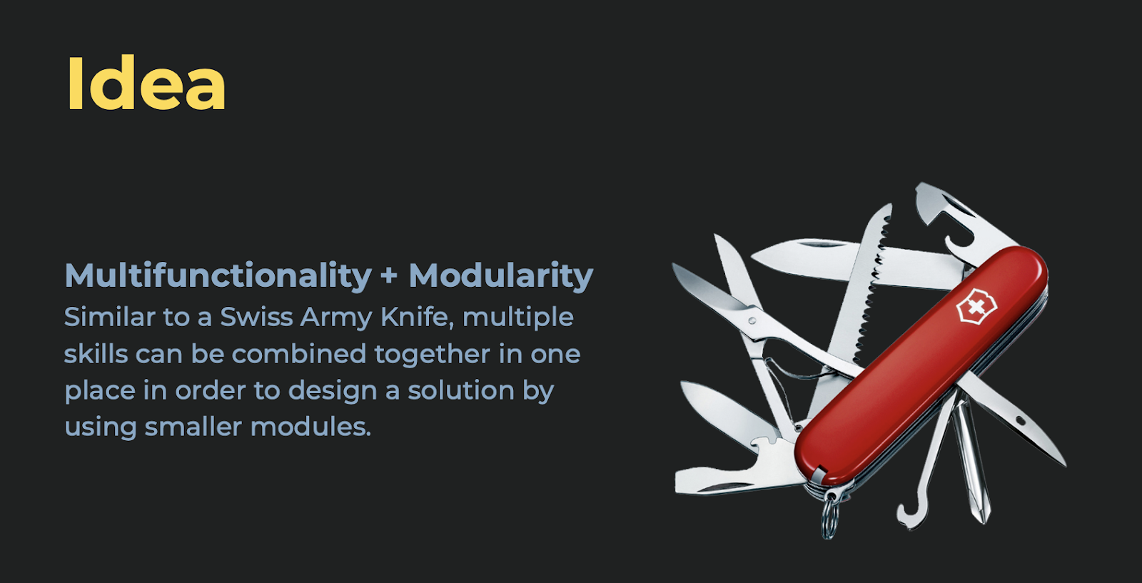
Idea
To have a portfolio website, my plan is to revamp my current portfolio with my new self-branding and the concept of multiple skills (swiss army knife). To do so, I need to collect data and information from my current and previous portfolio and take them to the next level. rmation from my current and previous portfolio and take them to the next level.
For me, the main purpose for having an online portfolio presentation is to showcase my works which show the variety of my digital skills so that businesses and investors from the industry would become interested in hiring me for a more senior job or in investing in my ideas by visiting my portfolio.
Based on this goal, my website needs to feature:
- Brief information about myself
- My works (detailed Portfolio)
- My Resume
- How to reach me
And most importantly, it should have a CTA to my portfolio on its landing page where it encourages visitors to see my works.
The main art style and look & feel of the website should follow my branding art style - which is using the modern and trendy 3D looking illustrations in a dark theme.
As for the landing page, the idea is to feature my mascot highlighting my skills with a call to action to my portfolio page. This page should also give a brief information on myself - such as How I am, what is my expertise and why they should hire me or invest in my projects/ideas.
- My name (Schahryar Fekri + self-branding)
- My expertise (Digital designer & developer)
- Why I’m Unique / USP (I have multiple skills + 20 years experience)
- CTA (See my portfolio + contact me)
My portfolio website should also be simple, easy to read, and viewable to all screen sizes from desktop to mobile phone (responsive).
To make a stronger impression, my landing page should include more information and details about myself and my works, which will aid in the indexing of my website in search engines like Google, giving me a better chance of being discovered by people searching for designers like me on the internet using relevant keywords and hashtags.
As my branding, portfolio showcase and CTA have the main hierarchy on my site, this additional information could be placed below the fold of my site preventing the above the fold section being bombarded with unnecessary details.
Website Structure
To plan out my website content and presentation, I need to have a structure for it. Regarding my achievement and goals of having a portfolio website, I came up with the following sections to make my site easily navigable for users and especially for my target audience.
Sitemap
- Home (Brief intro + C2A + Art Direction)
- Portfolio (Categorised)
- Work profile (pages)
- Links to actual site/presentation
- Links to Behance etc. - CV / Resume
- Web page
- Downloadable PDF - Contact
- Contact details
- Contact form
These sections will be available as a fixed menu bar on the top navigation bar of my site so it would be accessible all the time while browsing my website.
Portfolio Artworks
An ideal number of artworks for a portfolio would be 10-15 works. However it is a web-based portfolio, I can include a higher number than this, I will keep a maximum number of 15 works per each index page.
Here is the list of works I chose to include in my portfolio:
- Aromalab
- Planet Shop
- Gamescom
- Footballizer
- Takeo Angpao
- My Ear
- Fire Up Beer
- Body & Soul
- Quanta Game
- Paradiso
- KL Tourism
- Proton X70
Planning
Here is the plan for completing the portfolio website. As visible, the portfolio website will be completed by week 10. Here is a breakdown of tasks to be done by week 10:
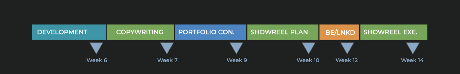
- Documentation & Journal
- Site architecture (site)
- Research
- Art direction + Brand ID modification
- Development
- Copy modification / writing
- Content for portfolio / works
Wireframes
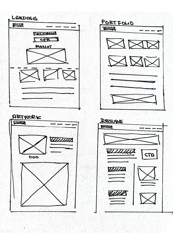
Low Fidelity
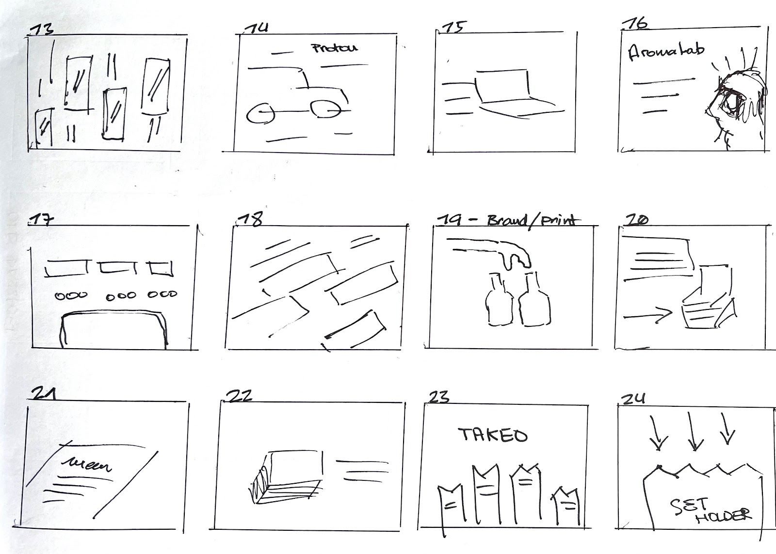
Low-fidelity prototyping is a simple and quick technique to turn abstract design thoughts into physical and testable items. Lo-fi prototypes' initial and most significant function is to check and test functionality rather than the product's visual look (Babich).
To kick off the design phase, I started drawing the lo-fi prototype of the main pages for my portfolio website. Below are the low fidelity wireframes for the main pages including landing page, portfolio index page, portfolio artwork page and resume screen. The other inner pages will follow the layout of the portfolio artwork page.
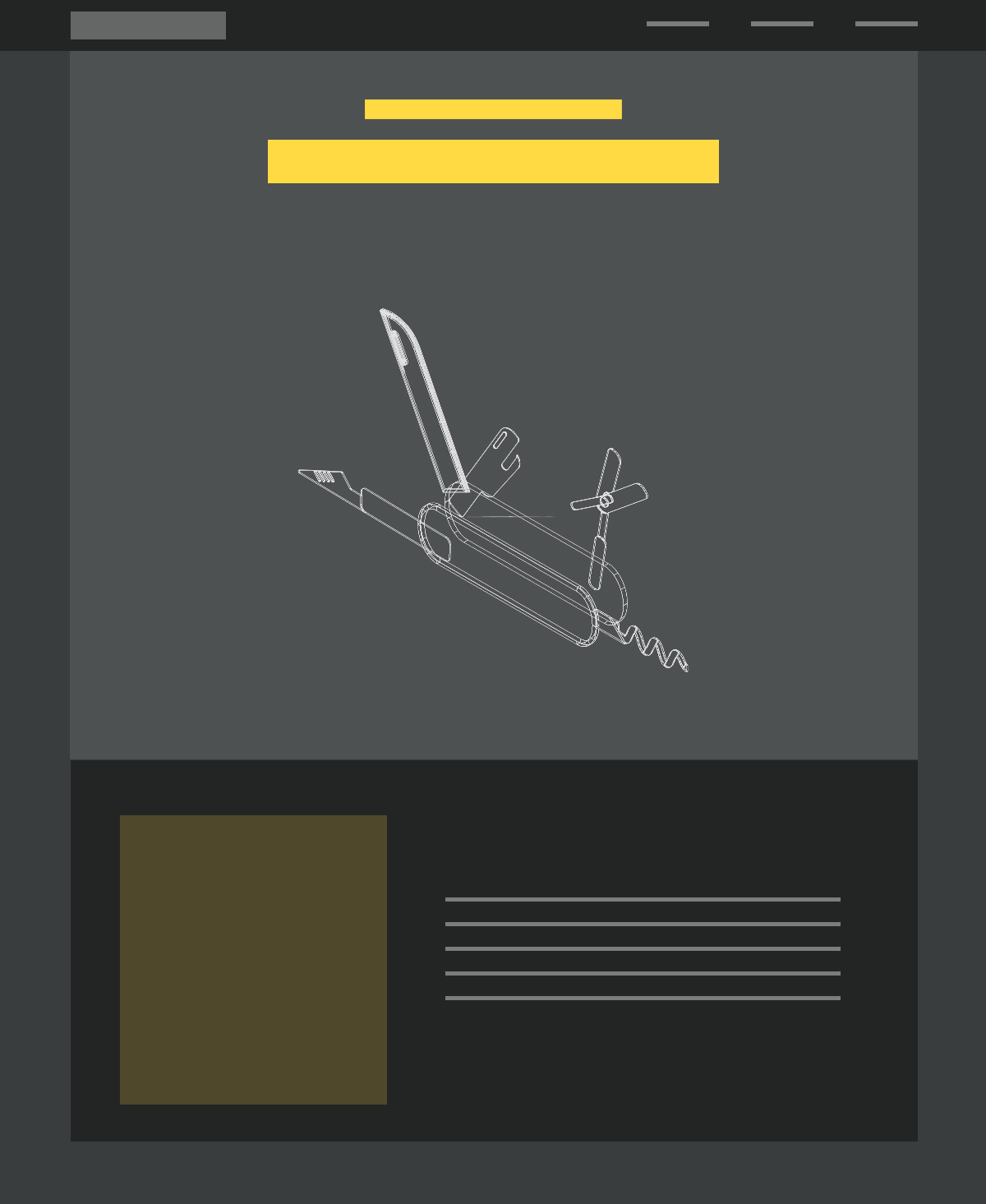
High Fidelity
Since high-fidelity wireframes capture the entire look and feel of a website/product, they are critical for overviewing the final stages of visual design (Moqups 2021). Therefore, I created a hi-fi wireframe for my landing page to preview the general look & feel of my website.
References
- Babich, N., 2017. Prototyping 101: The Difference between Low-Fidelity and High-Fidelity Prototypes and When to Use Each. [online] Adobe Blog. Available at: https://blog.adobe.com/en/publish/2017/11/29/prototyping-difference-low-fidelity-high-fidelity-prototypes-use#gs.q0npyh [Accessed 18 February 2022].
- Moqups Blog | Mockup, Wireframe & UI Prototyping News. 2021. Low Fidelity vs High Fidelity Wireframes: Which should you use? | Moqups. [online] Available at: https://moqups.com/blog/low-fidelity-vs-high-fidelity-wireframes [Accessed 18 February 2022].

Comments
Post a Comment